


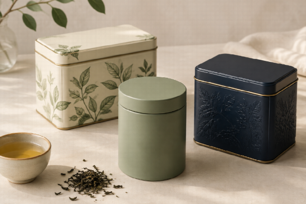
A tea tin has two jobs: hold the tea properly and give someone a reason to pick it up. A beautiful illustration can catch the eye, but the appeal fades if the lid sticks, the blend name is hard to find, or the tin does not fit on a kitchen shelf.
For tea brands, the most useful design ideas start with the product and how it will be sold. A sampler needs clear flavor labels. A gift collection needs a strong presentation. An everyday refill tin needs to be easy to open and use.
If you are planning a custom tea tin box, these ten directions offer a starting point for the artwork, shape, and finish. Each has a different strength—and a few details worth checking before production.
1. Illustrated Tins That Tell a Small Story
A garden scene, a hillside, or a quiet breakfast table can give a blend a setting. This approach suits seasonal collections and gift teas, where the packaging is part of what the customer is choosing.
Keep the story specific. For a breakfast blend, a simple kitchen illustration may say more than a crowded collage of cups and leaves. Reserve a clear area for the tea name so the artwork does not take over.
If a landscape suggests a particular growing region, make sure it matches the tea’s actual origin. An attractive scene should not create the wrong expectation about what is inside.
2. Minimalist Tins with One Distinctive Detail
A cream, sage, or navy tea tin can look considered with very little decoration. The challenge is making it recognizable when several similar packages sit beside it.
Choose one detail to carry the design: a distinctive typeface, an offset label, or a narrow band of color. Keep the blend name prominent and use the same layout across the range.
Review a printed sample rather than judging the finish on a screen. Pale text on a pale background may look delicate in a mockup and become difficult to read on the shelf.
3. Embossed Tins for Gift Collections
Embossing adds raised detail to the metal surface. A leaf motif, border, or brand mark can give a gift tin texture without covering it in extra graphics.
Start with a simple design that remains clear at the actual package size. Very fine lines may need adjustment, so ask the supplier to review the artwork before committing to tooling.
Check how the raised areas interact with printed elements and where labels will sit. A flat information panel can make the practical details easier to accommodate.
4. Apothecary-Inspired Tins with Readable Labels
Traditional label frames and restrained typography can suit herbal infusions or a collection built around familiar ingredients. The style works best when it borrows selectively from old shop packaging.
Use a decorative heading if it suits the brand, then keep the ingredients and brewing instructions plain. Too many borders, stamps, and small type styles can make a simple blend difficult to understand.
Let the design communicate craft through its details. Avoid implying medicinal benefits simply because the tin resembles an old remedy container.
5. Window-Lid Tins for Visible Ingredients
A viewing window lets shoppers see rolled leaves, petals, or pieces of spice. It can be useful when the appearance of the blend is part of the buying decision.
There is a tradeoff: a clear panel allows light to reach the contents. Harney & Sons identifies light, moisture, oxygen, and surrounding odors as concerns in tea storage and explains the value of opaque containers. A window should therefore be considered alongside the inner packaging and display conditions. Read Harney & Sons’ tea storage guidance.
If protection from light is the priority, an opaque lid with an accurate product photograph may be a better fit. Do not use a freshness claim to gloss over the window’s limitations.
6. Stackable Tins for Samplers and Tea Ranges
Stackable tins make sense when the customer is buying several blends. A shared shape helps a collection look organized, while separate colors and names make each tea easy to identify.
Put identifying information where it remains visible when the tins are stacked. A lid-only label will disappear beneath the next container.
Try the arrangement with filled samples. Check that the stack feels stable and that customers can remove a tin without wrestling with the others. A neat product photograph is only one part of the design.
7. Novelty Shapes for Seasonal Launches
A book-shaped tin or a small house silhouette can give a holiday collection a clear theme. Unusual shapes are especially useful when the package itself is intended to become a keepsake.
Work through the packing details early. Can the tea pouch fit without being folded awkwardly? Is there room for the label? Will the shape need a larger shipping carton?
If a new structure adds too much cost or complexity, try themed artwork on an existing rectangular or round tin. The visual idea may work without a custom silhouette.
8. Wraparound Botanical Prints
A continuous pattern can make a tin attractive from the side as well as the front. This is useful for countertop display and gift packaging that people will handle and turn over.
Choose plants that relate to the actual blend. Jasmine blossoms can support a jasmine tea design; cinnamon and cloves can suggest a chai that contains those ingredients.
Ask for the production template before finalizing the pattern. Check where it meets the seam and how it sits beneath the lid. Keep essential wording away from areas where the artwork wraps out of view.
9. Personalized Tins with a Planned Label Area
For wedding favors, corporate gifts, or small seasonal runs, one base design can accommodate different names and messages. A printed tin with a replaceable label or sleeve may suit this approach.
Plan the personalization area from the beginning. Test both a short name and a longer message so the layout does not work for just one example.
Keep the tea information separate from the occasion-specific wording. Customers should still be able to find the blend, quantity, and brewing instructions after reading the gift message.
10. Refill Tins Designed for Everyday Use
A refill tin needs to earn its space in the kitchen. An accessible opening, a reliable closure, and a shape that sits comfortably on a shelf are more useful than an elaborate finish alone.
Consider a permanent brand design with a changeable blend label. That gives customers a way to identify new contents without covering the tin in layers of stickers.
If the tin will hold loose tea directly, confirm that the interior is suitable for the intended food contact and provide appropriate care instructions. Describe reuse as an option; avoid treating it as proof of a lower environmental impact without supporting evidence.
How to Choose a Direction for Your Tea Brand
Shortlist designs against the way you plan to sell the product. Use this comparison to narrow the brief before discussing finishes.
| Packaging goal | Designs to consider | Main detail to test |
| Create a gift collection | Illustrated, embossed, or novelty tins | Presentation, opening experience, and packing requirements |
| Organize several blends | Stackable tins with a shared layout | Visible names and stable stacking |
| Show the tea itself | Window-lid tins | Light exposure and the inner packaging |
| Adapt packaging for events | Personalized labels or sleeves | Message length and legibility |
| Support repeat refills | Simple reusable tins | Closure, cleaning, and replaceable blend labels |
Test the Package with the Actual Tea
Do not choose capacity from weight alone. A bulky herbal blend and a tightly rolled tea can occupy different amounts of space at the same weight. Test the intended fill, including any pouch or sachets, and leave enough room to close the lid comfortably.
Also distinguish between the outer tin and the packaging that provides the seal. A decorative lid does not automatically make a tin airtight. Confirm how the complete pack will protect the tea before making storage claims.
Check the Label at Its Real Size
Print the artwork at full size and wrap it around a sample. Look at it from a normal shopping distance, then check how it appears in a small online product image.
Make room for product information, brewing directions, and any labeling required for the market where the tea will be sold. These details should be part of the layout before the decorative work is finalized.
Turn the Design Idea into a Clear Brief
Pick one or two directions and write down the intended fill weight, tea format, preferred dimensions, closure, artwork, order quantity, and delivery needs. Tell the supplier whether the tea will sit loose inside the tin or in a sealed inner pack.
To explore packaging for your collection, review Kaisi’s custom tin box options and discuss those requirements with the team. Request a sample to check the finish, lid, and filled fit before approving production.
The right tea tin should make the blend easy to recognize and pleasant to use. Start with those needs, then choose the artwork and finishing details that give the collection its character.